welcome to the frutiger aero area!
preamble
this design era of computers and corporations alike was present in the mid 2000s to around 2013, where it faded out and minimalism started to take over. however, with it's frutiger aero name being coined in 2017, and it's resurgence starting around late 2022, more attention is being brought towards it more than ever, especially by those who have experienced it first hand, and those who just like the look of it.
aesthetics
the look of frutiger aero was characterised by it's glossy textures and positive outlook of the world's future (at the time); this includes elements like marine life, water, oceans, the earth, highrise cities, vast green fields, and much more. frutiger aero also went by 'web 2.0 gloss', reminiscent of the glass borders of profiles in Windows Vista and Windows 7, the glossy textures of their ui(s), and the skeuomorphism of icons at the time. however, the windows operating systems were not the only ones to take on this aesthetic; macOS did with their skeuomorphic icons, glass taskbar, and the minimise, restore, and close buttons, which had a glossy look/texture to it. brands that strayed away from the OS scene also did this, take Sony for example - frutiger aero was extremely present on the PSP and the PS3, with bubbly application/settings icons prominently appearing as you would scroll through them with your controller, or by using the d-pad on the PSP. by 2008-2010, frutiger aero was practically everywhere. a turning point in frutiger aero was with Windows Vista against Windows XP; despite Windows Vista having an absolutely horrible reputation, its looks characterised a majority of what we know as frutiger aero today. Windows Vista used the Windows Aero theme, a backronym for Authentic, Energetic, Reflective, Open (see backronym in extras) which was also the backbone of it's design; the glassy borders and translucent UI came from the aero theme. although frutiger aero now is mainly a thing of the past, there are still some embers of it flaring up throughout the world...
effect on companies
although frutiger aero had a lot of personal effect, it also got a hold of most companies as well. one that has to be named is Microsoft, and their designs in the era. Windows Vista was when frutiger aero really started to get prominent in the design of corporations around the world, especially with the profile borders and profile pictures:

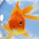


this design grew further in popularity proportionally to the users who liked it and used it. as long as it made Microsoft (+ other companies) more money, and brought more attention towards their software, they would continue using the (frutiger) aero style. this was true... until investors really started to suggest other ways to acquire more money.
demise
around 2011-2012, however, Microsoft (namely) started to transition to a new style of their programs, a new form of outlook for the future. this was the frutiger/flat metro style; a product where this stood out the most was with Windows 8, and it's much more well-received successor, Windows 8.1.
extras
if you really want to experience the magic or outlook of frutiger aero again, you can do so by searching for frutiger aero related stuff on the internet, or, if you want to be further involved within it, try making your own website, joining a community about it, or make a Windows Vista/Windows 7 virtual machine and adventure around! even better, if you have old enough hardware that is compatible enough with those OSes, try actually installing it on that hardware/device!
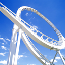
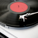
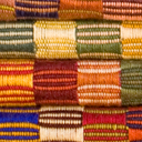
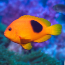
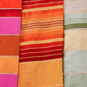
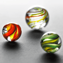
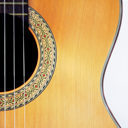
also, here are some Windows 7 profile pictures:
















backronym: acronym formed from a word that already exists
also, there are tutorials on youtube that show you how to transform your Windows 10/11 installation to emulate Windows XP, Windows Vista, and Windows 7! however, these tutorials can also take a relatively long time, so make sure you make a restore point before it and allocate time for the transformation.